ShopDreamUp AI ArtDreamUp
Deviation Actions


Suggested Deviants


Suggested Collections


You Might Like…


Featured in Groups


Description
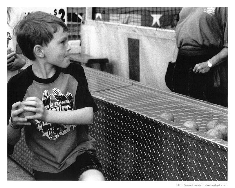
More photos from the fair! I hate the girl's hair in the upper left corner. She kept giving me the weirdest suspicious looks, but luckily the boy didn't notice me even though I was right next to them. Ninja ftw!
Sorry for the graininess, I did as best as I could with my scanner. As always, comments and critiques are GREATLY appreciated! It's the only way I'll get better!
Location: South Florida Fair
Camera: Canon EOS Rebel G
Film: Arista 400
Edits: Crops, sharpening, and slight levels.
Sorry for the graininess, I did as best as I could with my scanner. As always, comments and critiques are GREATLY appreciated! It's the only way I'll get better!
Location: South Florida Fair
Camera: Canon EOS Rebel G
Film: Arista 400
Edits: Crops, sharpening, and slight levels.
Image size
810x650px 377.55 KB
© 2010 - 2024 madnessism
Comments9
Join the community to add your comment. Already a deviant? Log In
Direction is a very important element in a picture, it can either make or break it completely and in this instance, it seems ideal. Having the subject so far back, his focused stare with his tongue sticking out is what helps give this piece its feeling of anticipation and excitement.
There are also many other elements which makes this piece feel dated, these include the patterns of the metal stand with the worn out baseballs on top, the huge net and the $2 font on the sign in the backgrounds all add to this feel of nostalgia that is felt throughout. The graininess isn't an issue since it already seems like a vintage picture. Using the sharpen tool did add more grain to the picture but it is still within an acceptable range.
The man standing at the top right adds a touch of intrigue, like the stereotypical stranger at the fair crying out to the kids to play the games, the ones our parents warned us about, the ex-cons that are doing what they do best. Not being able to see his face really makes him stand out even more in such a way and the shinny radiant watch, well that’s just perfect.
As the artist pointed out, the woman in the top left is feels more like a distraction but it’s a minor one that doesn’t really seem to matter that much at all. There’s even a sense of anticipation being felt there as well, so perhaps it does add something positive to the picture but it still might have been better without her in the frame.
So without following the conventional 'rules' of design this picture is very good indeed. All of the elements found in this picture blend in together perfectly, the angle and composition are all just right on. The perspective does seem like a clichéd snapshot of an earlier era but who is to say that’s a bad thing since it augments its most important feature of all; the evocation of childhood memories which is something that most people, including myself enjoy very much.